
"Wasty" is a conceptual design project aimed at raising awareness about waste reduction, with a strong focus on recycling and sustainability. The project explores how digital tools can encourage more mindful behavior around consumption and disposal.
The work includes both a landing page and an interactive app prototype.

Hypothesis
How might we change the habits and ease people who have awareness for waste recycling in order to improve their lives and social responsibilitty?
Value Proposition
Develop one-stop-shop for waste recycling information to ease day-to-day activities of people who have habits and awareness about recycling.
Goals
♻ Optimized usage of natural resources - reduce energy consumption for production (by 10% per annum)
♻ Reduce municipality costs for landfilling and recycling and make better use of them for other initiatives (by 5% per annum)
♻ Optimize landfilling waste reduction
♻ Reduce CO2 emissions
Business Model Canvas

Personas

Gergana Ivanova
Age: 28
Profession: Business Analyst
Martial Status: In a relationship, no children
Profession: Business Analyst
Martial Status: In a relationship, no children
「 The sustainability of the environment depends on each of us, so I believe that we can contribute to this process by taking personal responsibility for our own actions. 」

Kaya Stoyanova
Age: 32
Profession: Graphic Designer
Martial Status: Single, no children
Profession: Graphic Designer
Martial Status: Single, no children
「 I have long been interested in environmental sustainability, so I would very much like to have the opportunity to be part of a community that is very interested in the subject and stimulates action in this regards. 」
Competitive Analysis

Quantitive Insights (47 participants)

Qualitive Insights (12 participants)

User personas and stories

「 As a user, I want the app to have a mapping that shows all the places where I can recycle a product package, so that I can improve my daily recycling activities. 」

「 As a user, I want to receive more information about waste recycling, so that I can be more involved and motivated. 」
Information Architecture

User Flows
Map

Blog

Scan

Signal / Request

Paper prototype


Lo-fi Prototype
Map

Blog

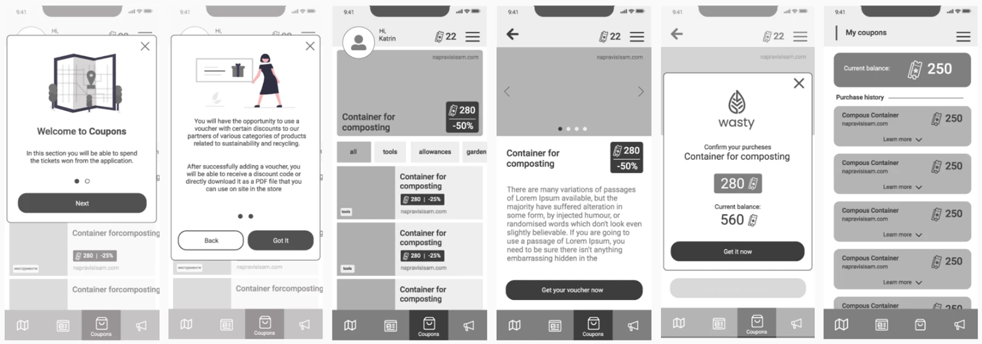
Coupons

Hi-fi Prototype
Moodboard

Style Guide
Grids and Sizing System
Columns: 4
Gutter width: 36
Column width: 64
Left Margin: 24
Right Margin: 24
Columns: 4
Gutter width: 36
Column width: 64
Left Margin: 24
Right Margin: 24


Color Palette

Typography
H1: 32pt (Poppins, #515151)
H2: 24pt (Roboto Bold, #515151)
H3: 22pt (Roboto Medium, #959595)
H4: 20pt (Roboto Regular, #707070)
Paragraph text: 16px (Roboto Regular, #707070)
H2: 24pt (Roboto Bold, #515151)
H3: 22pt (Roboto Medium, #959595)
H4: 20pt (Roboto Regular, #707070)
Paragraph text: 16px (Roboto Regular, #707070)
Design System
Toggle button and Check box

Input

Buttons

Navigation

Icons

Illustrations

Usability Testing
✔ 84.6% Success
✘ 15.4% Bounce Rate
✘ 15.4% Bounce Rate
Moderated: 4 participants
「 Burger menu: make the sections on whole screen. 」
「 Burger menu: make the sections on whole screen. 」
「 Separate coupons history in two sections: used coupons and new coupons, so the user knows which coupons he has already used and which he can use now. 」
「 Rename the "Coupons" section to "Store". 」


Unmoderated: 11 participants
「 Blog section: what does the time mean? How much time is left until the event? 」
「 Blog section: what does the time mean? How much time is left until the event? 」
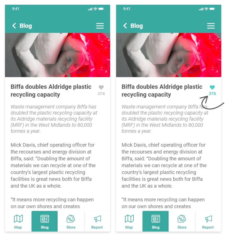
「 I tried to tap on the heart in one of the articles, but nothing happens. 」

Contrast test

