
SAP FIORI FOR WEB UI KIT
As the owner of the SAP Fiori for Web UI Kit, I lead the continuous development and monthly updates of SAP’s core design system components. The SAP Fiori for Web UI Kit is the foundation for product designers across SAP, enabling them to build consistent, accessible, and scalable user interfaces.
As the owner of the SAP Fiori for Web UI Kit, I lead the continuous development and monthly updates of SAP’s core design system components. The SAP Fiori for Web UI Kit is the foundation for product designers across SAP, enabling them to build consistent, accessible, and scalable user interfaces.
My primary responsibility is to ensure that the kit remains up-to-date, reliable, and user-friendly for all internal and external users. This includes maintaining the core Figma library, managing feedback loops, and ensuring cross-team alignment.
Component Creation & Maintenance:
· Designing and maintaining scalable, reusable UI components that comply with SAP's design guidelines and accessibility standards.
· Resolving issues reported by users and conducting regular reviews to ensure design consistency and technical accuracy.
Community Engagement:
· Managing the external SAP Web UI Kit presence, including social media updates and public library releases.
· Providing consultations for other teams looking to build their own kits using ours as a foundation.
· Acting as a central point of contact for product designers, supporting them in using the system effectively across different SAP products.
Team Enablement & Onboarding:
· Leading onboarding sessions for new team members and designers adopting the UI kit.
· Conducting internal and external Figma trainings and creating onboarding documentation.
Leadership & Team Syncs:
· Organizing and leading weekly design system syncs, offering feedback, reviewing branches, and aligning efforts across contributors.
Getting Started Section
To help designers onboard quickly, we included a dedicated Getting Started section with practical tips and tricks for working with the UI Kit. This section highlights common setup steps and best practices, such as enabling auto layout, using variants efficiently, and managing text styles and color tokens.


The Slot Concept: Flexible Component Architecture
We introduced the Slot component to make our UI Kit more modular and scalable. A Slot is a placeholder frame inside components like Cards, Dialogs, and Popovers that can be easily swapped without detaching.
We offer four slot types to suit different layout needs: Single Slot, Vertical Slot (Hug/Fill), Horizontal Slot (Hug/Fill), and Text Slot. Up to ten slots are pre-included and hidden in the Layers panel, ready to be revealed and used as needed.
How it Works
· Slots are flexible placeholders inside components that can be swapped with other elements.
· Designers can insert custom content or use predefined components based on their needs.
· Designers can insert custom content or use predefined components based on their needs.
Benefits:
· Supports design flexibility across products.
· Encourages reusability and consistency.
· Encourages reusability and consistency.


Trailing Actions
To enhance user experience, we introduced trailing actions in certain components. Rather than using separate booleans for each button, we simplified the logic by linking the visibility of the second button to the activation of the trailing actions boolean. This streamlined approach reduces complexity while maintaining flexibility.
Additionally, for the Text Property, we consistently use the pencil emoji ✏️ for better visibility, making it easier for users to identify and interact with editable fields.
Additionally, for the Text Property, we consistently use the pencil emoji ✏️ for better visibility, making it easier for users to identify and interact with editable fields.


The Side Navigation
One of the more challenging components we worked on was the Side Navigation, available in two states: Expanded and Collapsed. For the collapsed version, we needed to display navigation text on hover, which required a specific setup to preserve interactions.
To support vertical responsiveness, we introduced a nested empty frame inside the navigation. This allowed the component to adapt its height dynamically. Using auto layout alone caused interaction states to break, so the empty frame was essential to maintain both responsiveness and functionality.
CAX Components
CAX components extend the core UI Kit to address customer-specific scenarios that go beyond standard Fiori patterns. Built on top of existing Fiori components, they introduce additional variations, layouts, and states while remaining fully customizable. This ensures complex workflows can be supported without compromising visual consistency or alignment with Fiori design principles.
Benefits:
· Extends the kit’s applicability to a wider range of business scenarios.· Reduces the need for ad-hoc custom design work.
· Maintains consistency with Fiori design standards even in specialized cases.

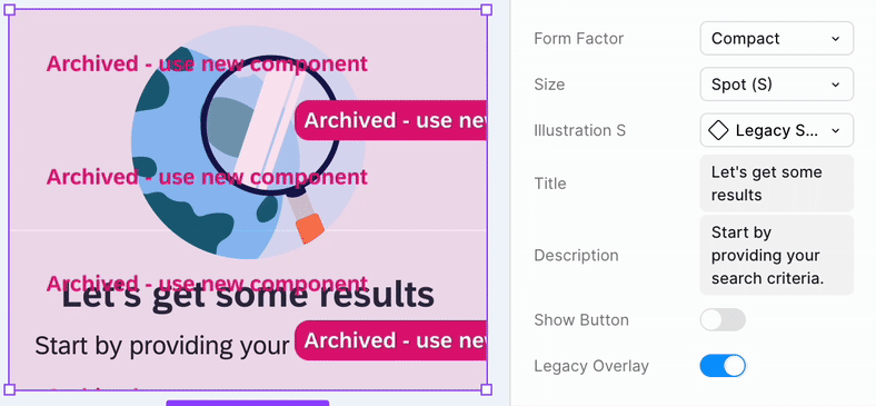
Deprecated Components
To signal when a component is deprecated, we introduced a pink overlay banner. This approach ensures that designs remain intact while clearly communicating that the component is no longer updated. Designers can choose to swap the component with the new version or hide the overlay via a boolean property and continue using it as-is.
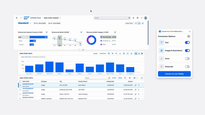
"Convert to Lo-fi" plugin
We built a custom plugin for the internal SAP Fiori for Web UI Kit that allows switching from hi-fi to lo-fi with one click. Product designers across teams requested this to run usability testing on lo-fi versions after completing hi-fi prototypes with the components from the kit.
· Works on frames, instances, or selections inside frames/instances
· Eliminates manual re-design steps
· Evaluated three approaches before implementing the plugin
· Built using vibe coding for faster iteration
· Eliminates manual re-design steps
· Evaluated three approaches before implementing the plugin
· Built using vibe coding for faster iteration
This category documents the workflow and impact of enabling quick fidelity switching inside our design system.


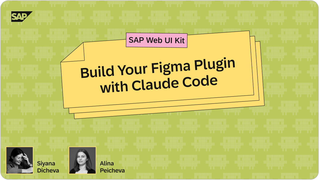
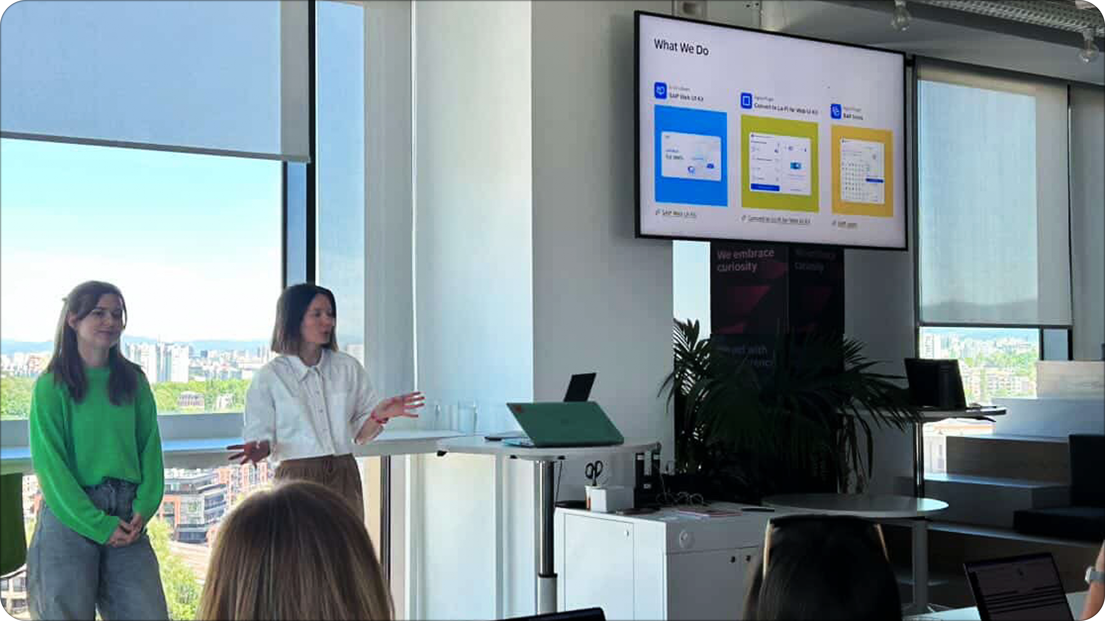
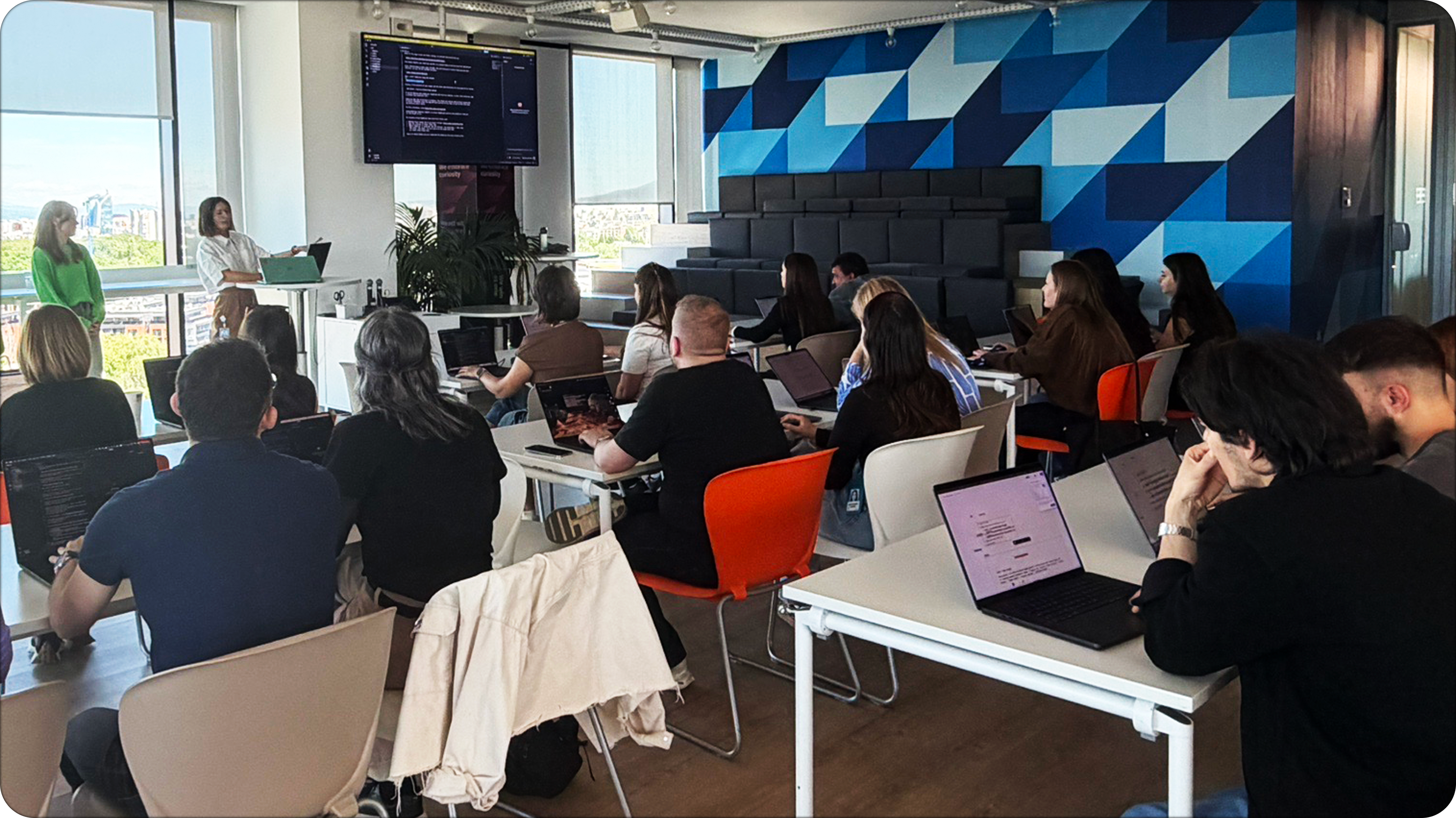
"How to Create Your Own Figma Plugin" workshop
We ran a hands-on workshop focused on how to create your own Figma plugin using Claude Code, guiding participants through the full build process from idea to working prototype. Participants can choose their own plugin concept and develop it during the session.
· Covers end-to-end build process from idea to functional prototype using vibe coding techniques
· Participants develop their own plugin concept with live guidance and iterative AI-assisted coding
· Focuses on working with APIs, development constraints, and real-world implementation limitations during rapid prototyping
· Demonstrates our workflow using vibe coding for faster iteration and experimentation
· Shares practical lessons learned from building real internal plugins, including constraints and design-system considerations
· Focuses on reducing manual design effort through automation and custom tooling
Learn More
SAP Web UI Kit Series: Introducing the Slot
